
Dilution-proof, October 1st, 2021
Cycling On-Chain is a monthly column that uses on-chain and price-related data to better understand recent bitcoin market movements and estimate where we are in the cycle. This fifth edition first takes a brief look at factors that provided a headwind for the bitcoin price during September. We then zoom in on an array of on-chain metrics that saw a significant trend change around the January local bitcoin price top, which in hindsight also set a floor price for the recent downturn in the bitcoin market. This column closes off by reflecting on Bitcoin’s current on-chain supply dynamics and macro context.
September Headwinds
After two consecutive months of positive returns on bitcoin during the summer, September provided several headwinds that caused bitcoin’s price trend to mostly move downwards.
After an initial price increase at the start of the month based on positive market vibes related to El Salvador formally adopting bitcoin as legal tender, price crashed hard on “Bitcoin Day,” September 7, when the law went live. The intraday price range that day was -$10,352 (-19.56%), a steep decline that was partially caused by a domino effect of long liquidations that each triggered another forced sell-off that pushed the price down further, liquidating even more long positions. As can be seen in Figure 1, the funding rates (green) on September 7 weren’t as high as they had been in Q1 when market euphoria was still in full effect. However, open interest (blue) had increased quite a bit over the previous weeks and saw a steep drop due to the forced unwinding of over-leveraged longs.

Figure 1: Bitcoin price (black), perpetual futures funding (green) and open interest (blue), as well as the total short (red) and long (yellow) liquidations (source)
That event surely scared some market participants who had not experienced this before or did not understand the underlying mechanics. Subsequently, headlines that Chinese housing giant Evergrande might be on the verge of bankruptcy revived memories of Lehman Brothers collapsing at the start of the financial crisis of 2008. Equity markets saw a significant sell-off on September 20, which was also reflected in the bitcoin price (Figure 1).
Despite these headwinds, the bitcoin price closed just $3,302.45 (7.01%) lower than it opened the month of September, showing some resilience. The bullish on-chain supply mechanics that were described in Cycling On-Chain #4 are still intact, suggesting that patient investors with a low time preference are not selling at these prices. Of course these trends can certainly change, for instance if the current macroeconomic circumstances worsen, but based on on-chain trends, these dips can be considered potentially favorable buying opportunities.
To underline the last point, we’ll use this edition of Cycling On-Chain to zoom out a little and look at an array of on-chain trends that have been present since around the January local top, which was already pointed out in a Twitter thread in early May. We’ll then show that the price levels of that January local top actually also provided a technical price floor where the bitcoin price trend found support during the recent market downturn.
Cooled-Off Prices Since January
First, we’ll have a look at the Bitcoin Price Temperature (BPT). The BPT is a metric that essentially looks at the four-year volatility in the bitcoin price by calculating the number of standard deviations that the current price is from its four-year moving average. As can be seen in Figure 2, the bitcoin price increased rapidly in Q4 2020 (left grey arrow), which resulted in a local top on the BPT (black) at a temperature of 7 in early January.
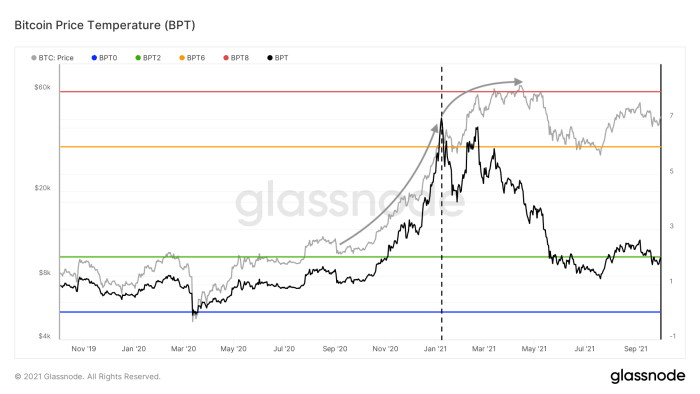
Figure 2: Bitcoin price (grey) and the Bitcoin Price Temperature (BPT, black) (source)
Since then, bitcoin returns started to taper off (right grey arrow) and price temperature started to cool down as a result. This BPT cooling was then exacerbated by the mid-May price crash. Current prices are similar to those we saw during the January local top, but price temperature has cooled down to less than 2, illustrating that these prices are now much more normal on a four-year timeframe than they were in January.
Next, we’ll have a look under the hood and assess a series of on-chain trends that have significantly changed since that same January local top.
Declining Old Coin Movement
One of the trends that have changed since January is a decrease in the amount of relatively old bitcoin that is being moved on-chain, suggesting that sell pressure of experienced market participants is declining. This concept can be assessed using on-chain data in multiple ways.
Perhaps the purest approach is to simply look at the average age of each bitcoin that moves on-chain each day. This is done by a metric called “Average Spent Output Lifespan (ASOL)” that is illustrated in green in Figure 3. As can be seen, ASOL was increasing throughout the late 2020 bull run and clearly peaked around the January local top, after which it has been in a downtrend.
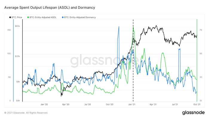
Figure 3: The bitcoin price (black) and the 7-day moving average of the Average Spent Output Lifespan (ASOL, green) and Dormancy (blue) (source)
However, not every on-chain transaction that moves necessarily holds equal weight when it comes to its potential impact on the bitcoin price. After all, a 1,000 BTC transaction has much more potential to influence price than a 0.001 BTC transaction does. This problem is solved by essentially correcting by the actual on-chain volume that was moved, resulting in a metric called “dormancy” that is displayed in blue in Figure 3. With he exception of a few outliers, dormancy has been in a steady downtrend since the January local top. Even more telling, it is currently at levels not seen since early 2017.
Remaining Long-Term Holders Are Now HODLing
Another way to utilize coin lifespan is to determine at what age an unspent transaction output (UTXO) becomes very unlikely to move again. Glassnode did so last year and found that at a coin age of above 155 days (roughly five months), unspent transactions are particularly unlikely to be moved again. As such, coins that haven’t moved for 155 days can be labeled “Long-Term Holder (LTH) Supply.”
Figure 4 displays the 30-day net position change of this LTH supply. As can be seen, coins that are more than five months old were increasingly being sold throughout the late 2020 bull run, as relatively experienced holders were selling into market strength. This sell trend peaked around the January local top, after which LTH sell pressure started to decline and has flipped to strong accumulation over the last few months — despite the steep price dip this spring and early summer.
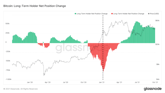
Figure 4: The bitcoin price (black) and Long-Term Holder 30-day Net Position Change (green and red) (source)
Experienced market participants that were skeptical of Bitcoin’s price run towards and break of its previous $20,000 all-time high (ATH) sold heavily against market strength up to the January local top, whereas those that remained afterwards appear to have little intention of selling — again, despite the steep mid-May price drop.
Long-Term Holder Transaction Volume Is Declining
The LTH net position change that we dissected above illustrates the LTH supply dynamics, but it is also possible to assess LTH behavior by looking at their on-chain transaction volume. Figure 5 shows the transaction volume of coins that hadn’t moved in at least six months. The transaction volume of that cohort also peaked around the January local top and has been in a declining trend ever since, with the exception of a temporary spike during the July relief rally that likely consisted of previously trapped investors that were looking for exit liquidity.
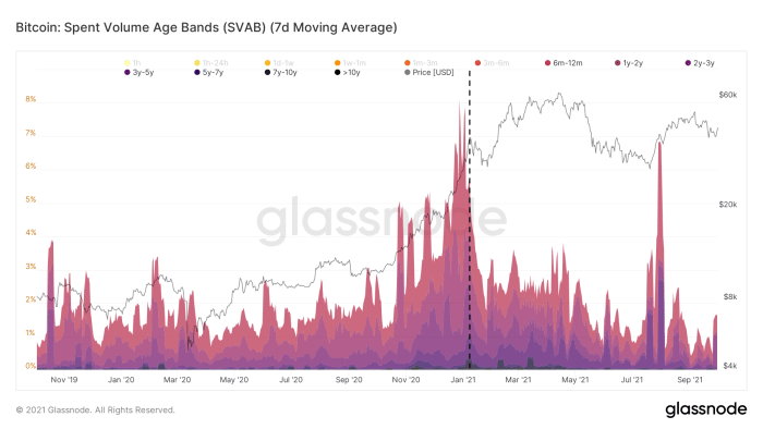
Figure 5: Spent Volume Age Bands (SVAB) for coins with a lifespan of six months or more (source)
Bitcoin’s UTXO Set Is Aging
Besides the coins that are moved (“spent”) on-chain, it is also possible to look at the current status of all UTXOs that exist. This was first done by Dhruv Bansal, who divided Bitcoin’s UTXO set into brackets of different ages, creating a metric known as HODL Waves. This metric was later adjusted by @typerbole, who weighted each HODL Wave by the value each of UTXO when it was last moved on-chain, creating the Realized Cap HODL Waves that are basically a more expressive version of the original metric.
As can be seen in Figure 6, the Realized Cap HODL Waves of coins with an age of up to one month (red colors) trended upwards until the January local top, after which they have been in a steady decline. This shows that up to the January local top, older coins that were previously unspent were being moved on-chain, resetting their lifespan to zero and allowing the bands of the warmer colors in Figure 6 that represent relatively young coins to swell. Since January, these trends have cooled off considerably, allowing the bands of the cooler colors to recede, showing that Bitcoin’s UTXO set is aging again in aggregate.
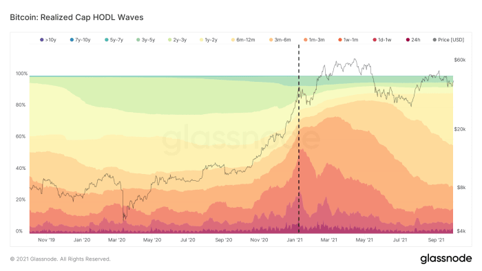
Figure 6: Realized Cap HODL Waves (source)
Declining Miner Sell Pressure
On-chain data also allows skilled analysts to estimate which bitcoin are in the hands of miners. Throughout 2019 and 2020, this data showed that the bitcoin balances that were considered to be in miners’ wallets saw a steady uptrend. Right before the January local top, those balances declined steeply (Figure 7, green), which was followed up by relatively large amounts of bitcoin being sent from those miner wallets to exchanges (Figure 7, blue). Over the past six months, those trends have both reversed, suggesting that miner sell pressure is relatively modest again — despite the hard Chinese crackdowns on miners and resulting dramatic hash rate drop that we saw in May and June.
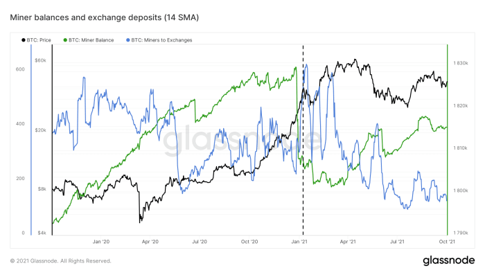
Figure 7: The bitcoin price (black), miner balances (green) and exchange deposits (blue) (source)
The May 19 Capitulation As The Next On-Chain Market Turnaround
The…
Read More:January On-Chain Bitcoin Price Trend
2021-10-02 01:00:00